
C&C Soda Co. has been a staple in the North East since 1865, offering an eclectic mix of sodas and seltzers at an affordable price. With over 150 years of history, the brand held strong name recognition and nostalgic value—but their visual identity had become dated and lacked cohesion and visual clarity on shelf. They approached us with a challenge: elevate their identity without losing the essence of what made them beloved—bold flavors, local personality, and a sense of fun.
Visual Identity
Packaging


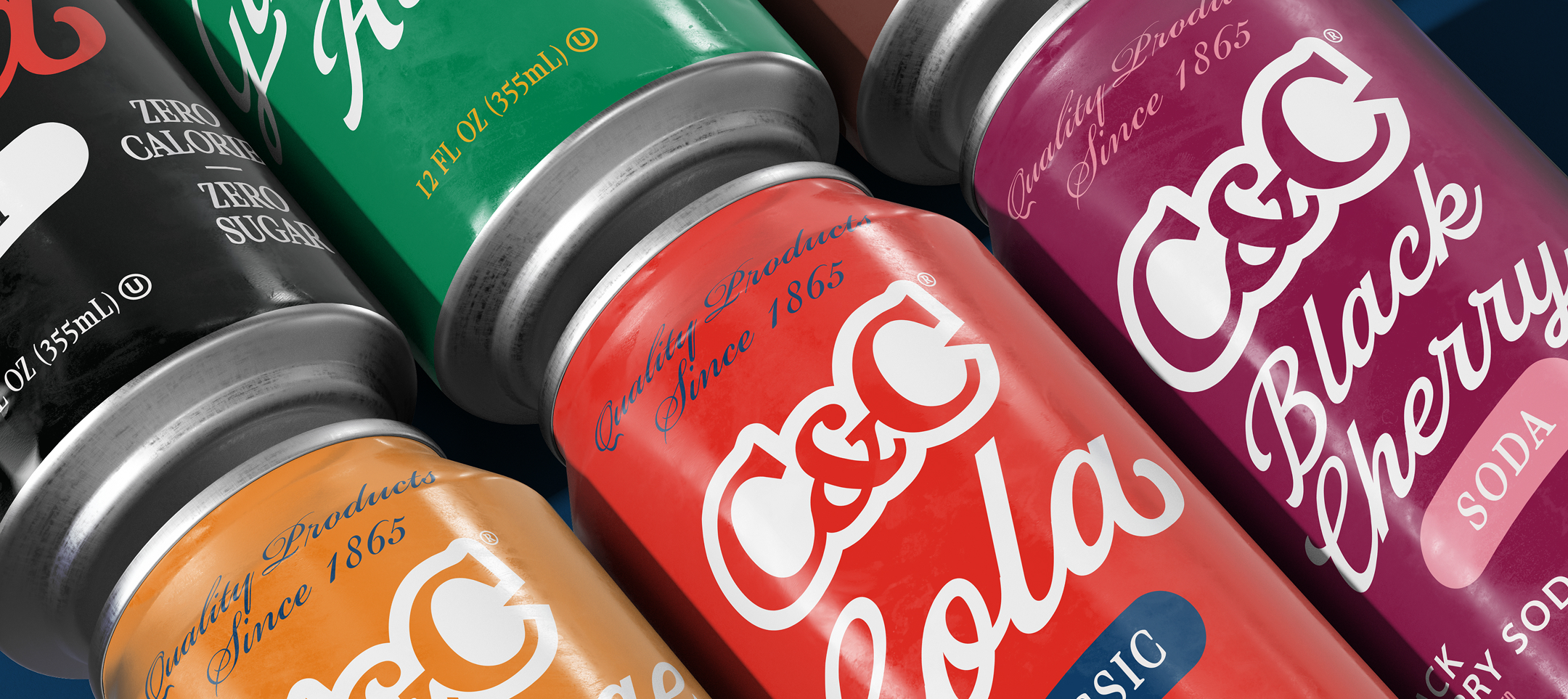
The design system needed to span a wide array of products: seltzers, sodas, teas, specialty flavors, and multiple bottle and can sizes (over 80 SKUs in total). Flexibility and scalability were key. We began by diving into the C&C archives—drawing inspiration from vintage packaging, hand-lettered type, and the joyful personality that defined the brand in its earlier decades.
We introduced a vibrant, modular color palette that gave each SKU its own personality, while still feeling unmistakably "C&C." Custom illustrations and retro-inspired typography added a sense of whimsy, while nodding to the brand’s deep roots.


Following the success of the seltzer line, we expanded the system to dozens of flavors and product variations—ranging from classic colas to niche flavors like blue raspberry and pineapple. Each was brought to life with its own flavor-specific illustration and distinct palette, all while maintaining consistency across the growing family of products.


We created custom patterns and illustrations to give their Cooler line a distinct, eye-catching look while highlighting the bold flavors of the line.


